
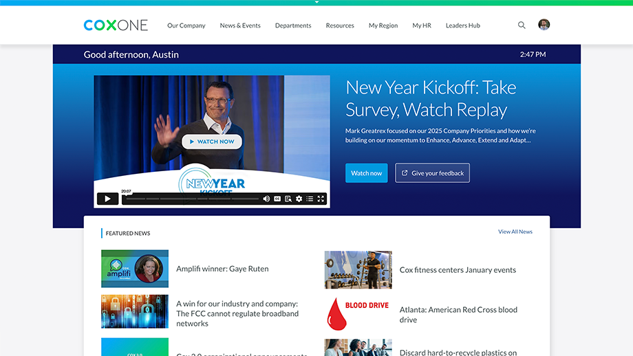
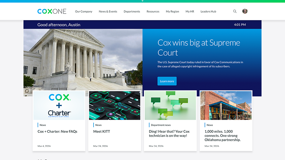
This project redesigned the CoxOne homepage Featured News web part from a 2‑column / 3‑row layout (6 stories) to a 4‑column / 1‑row layout (4 stories) so content stayed fresher, all featured items were visible without scrolling, and targeted content didn’t block the experience when regions had limited news.
My role: Senior UX Architect. I owned the UX redesign, clarified the content strategy implications (company vs regional targeting), and partnered with platform/vendor stakeholders on configuration and rollout decisions for the Featured News web part.
Impact: Reduced “content hunting” pressure by lowering the required featured news slots (6 → 4), made all featured stories visible above the page fold on load, increased the prominence of imagery and titles, and improved content clarity with publish dates and a video indicator (so employees could quickly identify what’s new and what includes video).
The prior Featured News format created multiple friction points: it required too much fresh content to keep six slots updated, pushed stories below the fold, over-weighted regional targeting (making it harder to find relevant content),and didn’t provide key scanning cues like publish date or whether a story included video. This redesign focused on scanability, editorial sustainability, and fairness in how stories are perceived.
Cox Communications
All Employees
Senior UX Architect
August 2025 - October 2025
Figma, Photoshop, Illustrator, SharePoint
Before
After
• Too many slots to keep fresh: Reduced the module from six featured stories tofour so the experience stayed current without constant content “hunting.”
• Below-the-fold visibility: Adjusted the layout so all four featured stories are visible when the page loads.
• Regional targeting complexity: Shifted targeting so only the fourth story is region-targeted, with a fallback to all-employee content when regional content isn’t available. (Maintaining the ability to target a specific box was an explicit requirement discussed with partners.)
• Weak visual engagement: Increased thumbnail/image and title prominence to support faster scanning and higher click intent.
• Missing “newness” cues: Added publish dates so employees can immediately tell what is new versus older content.
• Missing video indicator: Added a visual video icon so employees can see at a glance if a story includes video.
• Redesigned the Featured News information architecture and visual hierarchy for faster scanning and clearer prioritization
• Simplified the content strategy model (company vs regional) to reduce operational friction while retaining targeting capability
• Partnered with platform/vendor stakeholders during configuration changes and rollout activities related to Featured News updates
• Above-the-fold parity: Made all four stories visible on load so story order mattered less and content owners didn’t feel disadvantaged if their item wasn’t in a “top two” slot.
• Editorial sustainability: Reduced the number of required featured items to better match real-world content supply and prevent stale featured modules.
• Targeting with resilience: Kept regional targeting, but limited it to one slot and added a fallback so the module never looks empty due to limited regional content. (Targeting a specific box was a known design requirement.)
• Stronger scan cues: Promoted image size, added publish dates, and added avideo icon to support rapid decision-making during quick visits.
• Image handling and consistency: Featured News image behavior was treated as a platform concern (thumbnail sizing and how images are cropped/handled), so the layout redesign aligned with the need for predictable image presentation.
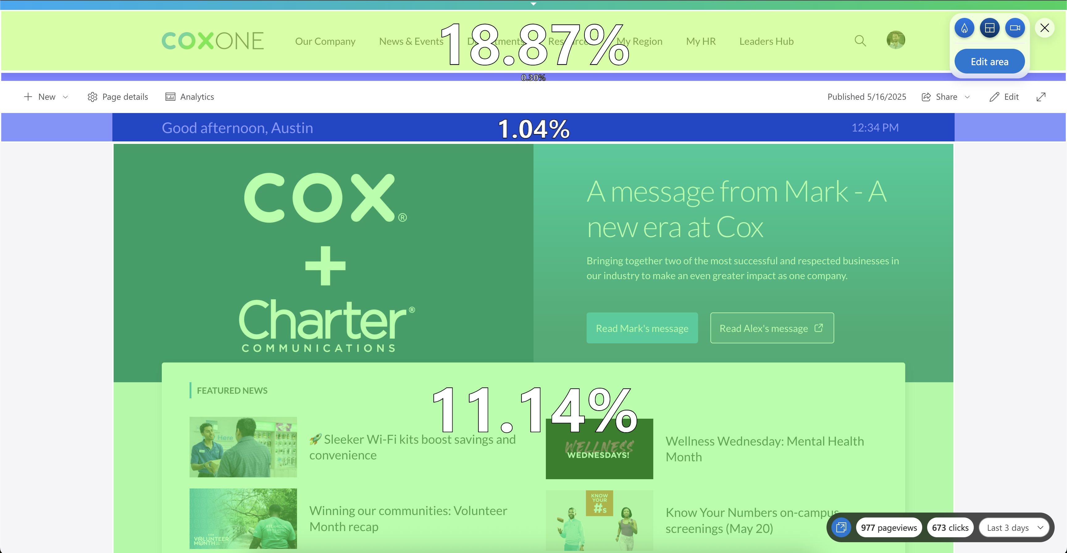
Our data showed that, over a single workday, the page received 673 total clicks, with 31.35% occurring on content above the fold. Most of the remaining clicks were L2 and L3 navigation, while content below the fold saw limited engagement.
Successes / Failures

Success: Content Hierarchy
This change allowed our team to convey equal importance to all featured articles, satisfying the needs from the content creators and leadership.
Success: Budget
No additional budget was allocated for this project. All work and implementation were completed with existing resources.
Failure: Visual Interference
We later identified an issue with the original design: without a clear border, certain hero article images visually competed with featured article images. A 5px border was added to create separation and prevent interference.